Here's the New BBC Three Logo as It Prepares to Move Online

It look like it’s for BBC II! and not BBC Three, right?

Image via BBC

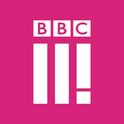
BBC Three is set to become online only this month, and as part of rebrand they’ve unveiled this new logo. Only, that exclamation mark makes it look like it’s for BBC II! and not BBC Three, right?

Some people think it looks like the ‘iLL MANORS’ album cover.

Anyone from @bbcthree listened to this album from 2012? pic.twitter.com/3XL9OdFHS7

— Sean Spooner (@spoonersean) January 4, 2016

Others think it’s a ‘Metal Gear Solid’ reference.

❕ Has the @bbcthree new logo gone all #MetalGearSolid? ❕ pic.twitter.com/Qw5utMSTIe

— Mark ®️ 🎮 (@andsomegamers) January 4, 2016

We don’t mind if the logo looks a bit crap as long they keep showing People Just Do Nothing and Reggie Yates documentaries to be honest. 

Want to know more about our new look? Read more 👉https://t.co/MFX1DqgKyr https://t.co/UWpxTjjahP

— BBC Three (@bbcthree) January 4, 2016


Latest in Pop Culture