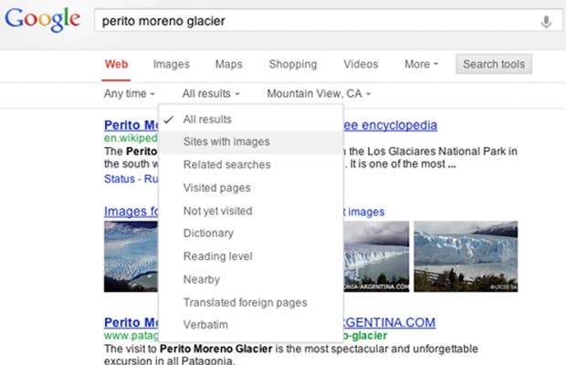

Google yesterday announced its revamped search page layout which repositions navigational tools from the upper left of the page to the top of the page on its blog.
The web giant started rolling out its "simpler, cleaner design" last year for tablets. Smartphones users started seeing it a few weeks ago, and now people Googling from a desktop or laptop will get the more streamlined design that sees the removal of navigational tools and frees of screen real estate. CNET also reports that certain search results did not display advertisements like the previous Google search page.
Jon Wiley, the lead designer for Google Search, discussed the new Search design in the blog post:
"With the new design, there's a bit more breathing room, and more focus on the answers you're looking for, whether from web results or from a feature like the Knowledge Graph."
How do you like the redesigned Google search? Does the horizontal design and drop-down menus make it easier to navigate and manage?
[Think Digit via Google]